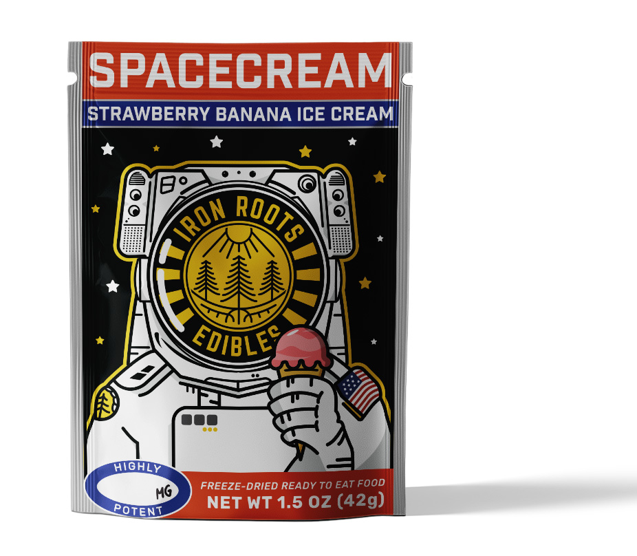
An up and coming Medical Cannabis Co. working on establishing a friendly Identity. Commissioned for a logo that would be easily applied to all packaging of all shapes and sizes. The client wanted a logo that related well to the midwest. Inspired by the great lakes and the thick swampy timber that lines the shores of upper peninsula. The logo ended up being a circle emblem that offered a decorative border that could be used easily for logo text. Since the client offers a variety of different categories of products, he wanted to be able to swap out tag lines easily. Working well in both a 1 and 2 color solution, it really brings in the culture of the region to life.


Over the years Joe has helped us put the look on our brand that tells our story without words. From our first project to our last, Joe has helped us create a look for our company that not only is authentic and trustworthy, but also meaningful and connected to the entire brand itself.


